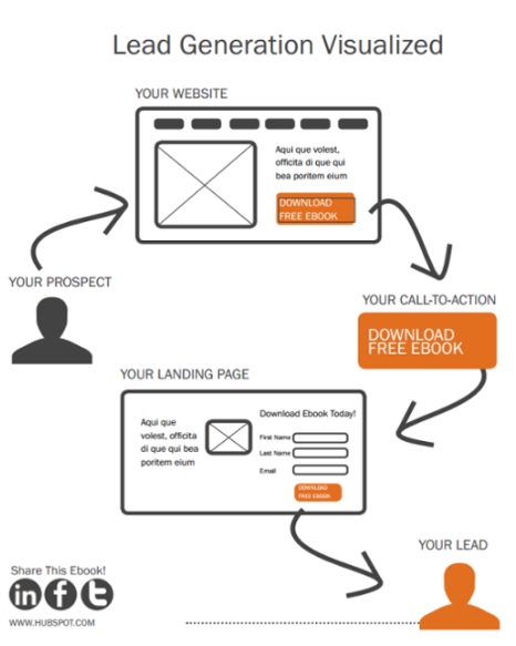
Your website has great content, but you are not able to get conversions or leads. Can it be the wrong call-to-action? It probably is. Call-to-action (CTA) is one of the most critical aspects of a marketing drive. It starts with writing great content, to using a call-to-action effectively. CTAs can sound easy to write and implement, however, in reality, it is hard work and takes practice and patience to master. As a business, you should always focus on writing the best CTAs for your best content and landing pages. And, that’s why, in today’s article, we will focus on listing the best practices of using call-to-actions (CTA).
The Best Practices Of Using a Call-To-Action
Before we dive deep and discuss some of the best practices, we first need to understand why they are so important. CTA is a simple way to guide the visitor to take action. The action is anything including lead generation, conversion path, or simply asking readers to interact with the article through the commenting system. With CTA, you can also ask users to fill in a form or divert them to a landing page.

Most of the time, visitors don’t know what they want. It is your job to help visitors and guide them to their next step with the help of CTAs. The CTAs should not only be engaging but should also match the context. For example, if you write a review about a particular hosting service, you can include “Get 30% Discount Now” copy in your CTA. By doing so, you can divert the visitors to a landing page where they can buy the hosting and give you a commission or referral bonus in return.
With the clear idea of how CTAs work, let’s start with the best practices below.
1. CTAs Should be Actionable
Nowadays, there are still many CTAs that are not action-oriented. It is clear that not everyone understands the true purpose of a call-to-action message. The call-to-actions should explicitly mention the benefit that they carry. They should be as descriptive as possible and should take the visitor persona into account. For example, your CTA should always contain a verb. It should also be a little bit surprising for the visitor.
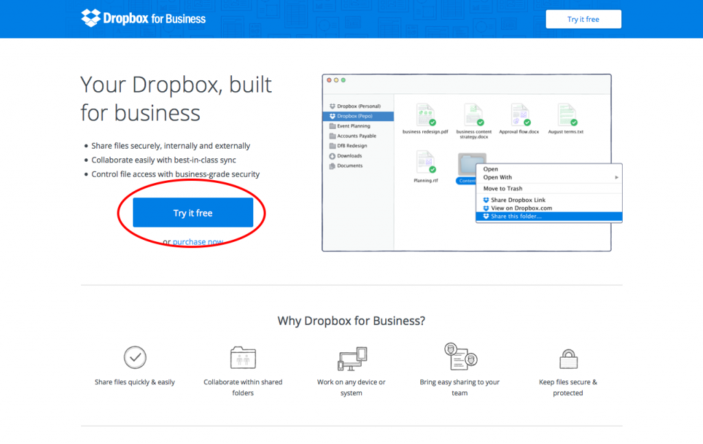
A good approach is telling what benefit a user will get by clicking a call-to-action button. One great example of an actionable CTA is “Remember Everything.” The Dropbox team uses “Try it Free” as main CTA message for their product. It is meaningful and actionable at the same time.

2. Make Your CTA Popup
Call-to-actions are reliable only when they stand out on your website. Many websites have CTAs, but fail to make them visually appealing for the visitors to even take note in the first place. To ensure that your CTA is visible to your visitors, you should test out different aspects of a CTA, i.e., size, contrast, and image. Let’s discuss the different aspects below briefly.
Size: Getting the right size for your call-to-action requires experimentation. It should neither be too small, nor extremely big. A good sized CTA will only attract more clicks. Also, you should make sure your CTA is responsive and mobile-friendly.
Image: It is not necessary to use images in your CTA. However, if you do, it is advised to use a high-quality one. The picture should also be chosen carefully and relevant.
Here is an example of an amazing Call-to-action popup by Brian Dean
3. Sense of Urgency

Our human brain is wired in a way that hates missing out on something useful. To take advantage of it, your call-to-action should give the user a sense of urgency. You can use a timer, or give them a proper CTA that make them take action now or never.
For example, you can use “Limited Quantity – Buy Now” as a CTA to make users think twice before leaving. Also, don’t be too aggressive as it will alarm the visitor and he will leave without thinking twice.

4. Go Personal
People like attention and the CTA represents a way you can get connected with your audience. When writing call-to-action messages, you should try to use both first and second person tenses. This will help you connect with your audience more effectively and convince them to take action based on the call-to-action.
5. The Fold is Not Where All the Action Happens
It is a common belief that you should only put CTAs above the fold. However, it is effective; it doesn’t mean that you cannot utilize the rest of the space left on your webpage. For starters, you can use multiple CTAs across the page. But, do not overdo it as multiple CTAs flooding the page will have the opposite effect.
6. One CTA Every Page
It doesn’t matter what information or knowledge you are sharing using your website; you should always have at least one CTA on each page of your site. It can be a product page, article page or even the services page. In short, you should always try to convert a visitor into a potential lead. If you are using SEO optimized themes, you can also use keywords in your CTAs to further optimize the on-page SEO.

7. Do Testing
There is no fast rule or recipe that will guarantee a higher conversion rate, as “one size to fit them all” is just a myth. Optimisation on your website is all about experimentation and testing. That’s why you should create variations of a CTA and then test all of them for a certain period. You can change the copy, the text size, the color, and anything that you think can have an impact on your visitors.
The end goal is to find out the best one and use it consistently across your website. The conversion rate depends heavily on multiple factors, and according to HubSpot, while the click-through rate ranges from only 1-2%, the conversion rate can be anything within 10 to 20%.
If your CTA is not performing at all, you might want to change its location on your website, and test it for a more favorable position. In the end, you need to find what works for you, and it can only be done through experimentation.
8. The Value Proposition
The last point that we are going to discuss is the value proposition. You need to think from the perspective of a visitor. What value does it provide to the visitor, convincing him to go forward and take action?

If the answer does not feel compelling to you, then it probably requires a change. Always try to place yourself in your visitor’s shoes. By doing so, you will find an optimal balance between action and value proposition, giving visitors enough reasons to click on the CTA.
Conclusion
That’s it! We discussed the eight best practices for using a call-to-action. At the end of the article, we highlighted the fact that you need to find the best approach yourself. Some of the best practices might not work for you, and that’s fine. This is where you should start experimenting and try to understand what works. Also, you should not be bobbed down into tests and experimentation. The goal is to get something valuable out that will help your business grow and prosper.
Moreover, you should note that CTAs can only perform to their potential if your website is top-notch. Considering that you might be using WordPress, you should have the best WordPress hosting, along with a great theme and SEO plugins. The website should also load fast and have a great UX design.
So, what do you think about the best practices that we listed here? Comment below and let us know.


